- /
- /
- /
Styling a form field with Style Selector
Field Styling
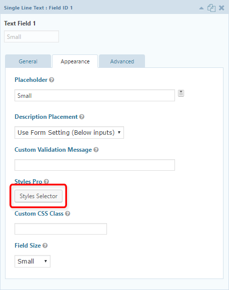
Gravity Forms Styles Pro comes with a GUI based Style Selector for fields, which you can use to easily create a form layout. All built-in Gravity Forms fields are supported.
Styles Selector can be found under Appearance when editing a field.
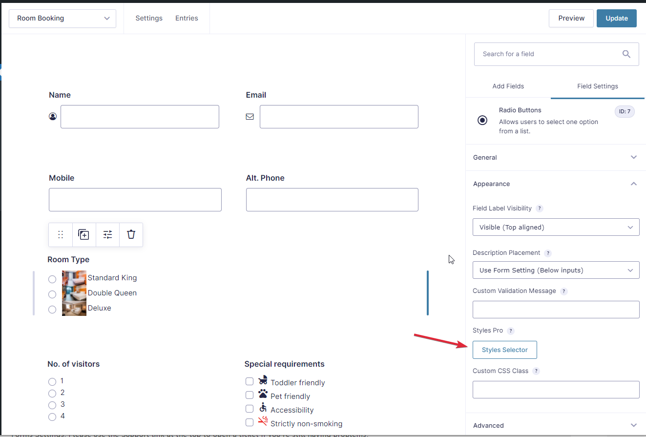
Using Styles Pro: Style Selector
Styling the choices of your Checkbox or Radio fields with images and icons
In the Style Selector, you will find several options. Some options are stand-alone, others can be used in combination. For example, image effects are available for all options that use one of the image styles. Some style options can be further customized using the Style Effects options that show up at the very bottom of the fold if ti is compatible with your style. You may want to add a hover outline, or remove style padding entirely for some of the styles, for example.
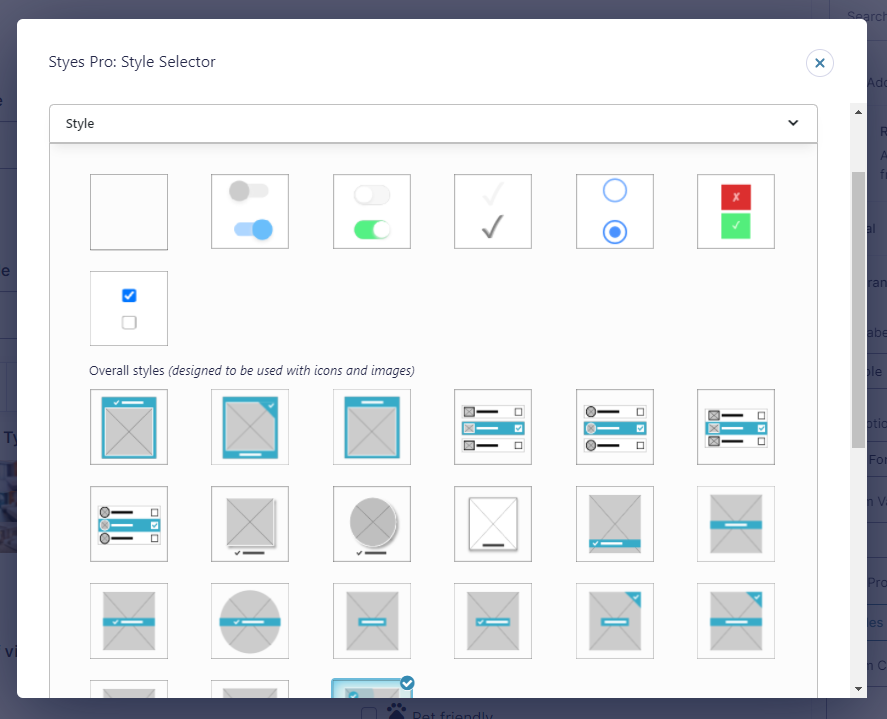
Style Selector has been designed to be intuitive to use. Usually hovering over an option should be enough to understand it. Please refer to the video for more information.
The following styling options can be chosen for each field.
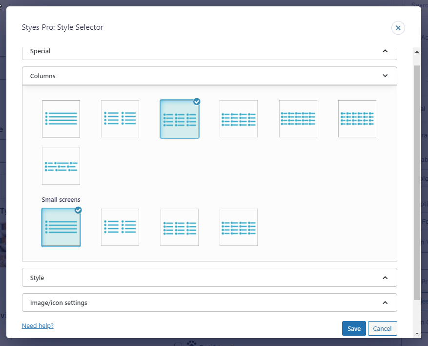
- 1 column
- 2 columns
- 3 columns
- 4 columns
- 5 columns
- 6 columns
- Automatic (options will adjust based on their widths without being divided into columns)
Smaller Screens
Columns will be reduced on smaller screens by default to make sure of a smooth user experience. But if you have special cases, where for example you would want to spread out the options in a different way, you may opt for a different distribution, from the following:
- 1 column
- 2 columns
- 3 columns
- 4 columns
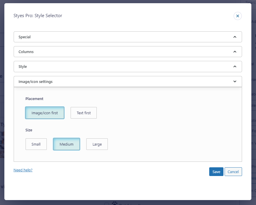
Switching the order of the label and image/icon
On your choices it’s possible that you would want to switch the order of image/icon and the label of your field. You can do that from the Image/icon settings fold for your field.
Legacy Mark-up Enabled Forms
The following options can be used to create layouts in Legacy Markup forms:
Layout
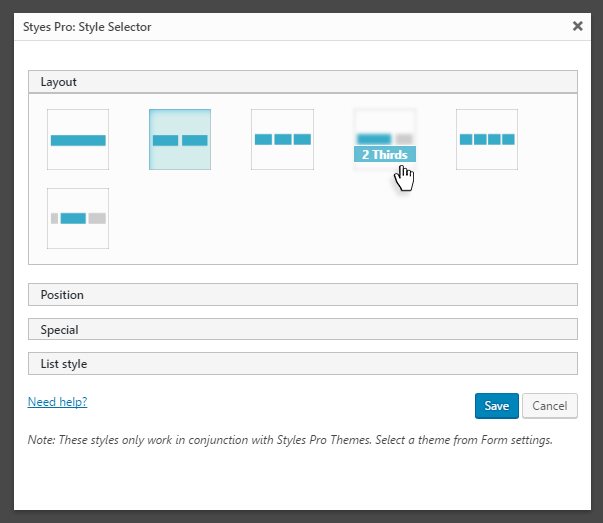
- Full width
- Half width
- 1/3rd
- 1/4th
- 2/3rd
- Inline
Position
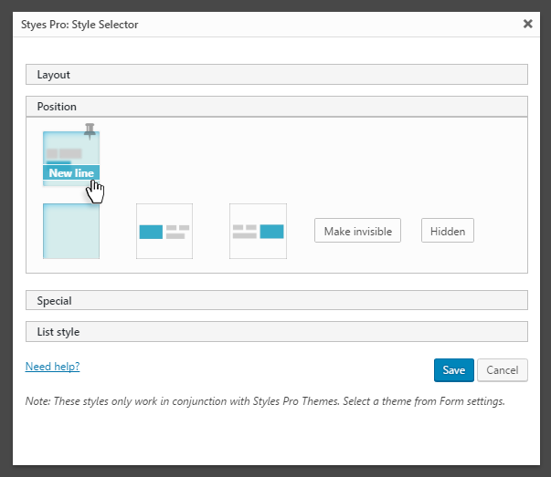
- None
- New line (toggle, can be used in conjunction with other positioning options)
- Float left
- Float right
- Make invisible
- Hide
All styles are responsive. Styles have been written keeping best UX practices in mind. You do not have to do any more settings, Styles Pro should adapt responsively based on the platform.\
For Older Versions: Gravity Forms <2.5
Field Styling
Gravity Forms Styles Pro comes with a GUI based Style Selector for fields, which you can use to easily create a form layout. All built-in Gravity Forms fields are supported.
Styles Selector can be found under Appearance when editing a field.
Using Styles Pro: Style Selector
Style Selector has been designed to be intuitive to use. Usually hovering over an option should be enough to understand it. Please refer to the video for more information.
The following styling options can be chosen for each field.
Layout:
- Full width
- Half width
- 1/3rd
- 1/4th
- 2/3rd
- Inline
Position
- None
- New line (toggle, can be used in conjunction with other positioning options)
- Float left
- Float right
- Make invisible
- Hide
Special
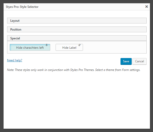
- Hide character left (Single Line and Paragraph Text Only)
- Hide label
List Style
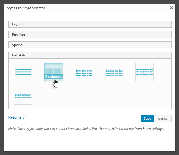
- 1 column
- 2 columns
- 3 columns
- 4 columns
- 5 columns
- Automatic (options will adjust based on their widths without being divided into columns)
Responsive
All styles are responsive. Styles have been written keeping best UX practices in mind. You do not have to do any more settings, Styles Pro should adapt responsively based on the platform.
I’m having trouble figuring out how to style the complex fields so that the first and last name are inline. It’s on block display now
There an example here on page 2 of this form.
https://glquote.com/application/
Hi Mike,
For some reason the regular Gravity Forms CSS is also being loaded on the page. Did you use a non-standard widget to embed the form? Try using Gravity Forms’ own shortcode or block, that should sort the issue. It’s a CSS conflict. If that doesn’t work, you may turn off Output CSS option in Gravity Forms Settings. Please use the Support link at the top to open a ticket if you’re still having problems.
I ended up doing this and it worked:
.gf_stylespro.sp_flat .ginput_complex .name_first {
width:48%;
display: inline-block;
}
.gf_stylespro.sp_flat .ginput_complex
.name_last{
width:48%;
display: inline-block;
}