- /
- /
- /
Add images/icons to Radio button and Checkbox options
Styles Pro makes it easy to add icons and images to your Gravity Forms and style them in many different ways. You can use List like views or Frames among others and further set them in columns or change the choice’s label text shows, before, after, or nowhere. Adding such ornaments can reduce friction and immediately improve the user experience for your form users, potentially increasing conversions.
Adding Images to Your Choices
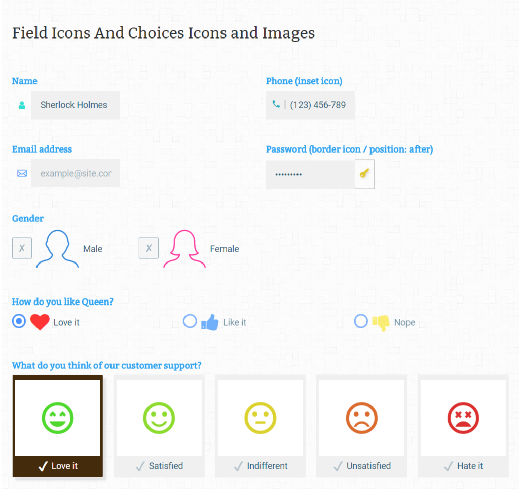
To add images to your radio button or checkbox options, simply open the field options and your should see an icon to add interactive ornaments beside the text boxes for each options. Once clicked Styles Pro’s Icon / Image Selector window should open, where you can find all the icon sets you have enabled, along side an option to add custom icon or images. You can use a URL for the image or simply click on Select Image to upload or reuse an image already in your library. You may use also use animated GIFs, if you wish. You can use images with different sizes, they would be fitted based on the Column settings in the Style Selector for the field, it is however highly recommended that you match the sizes of the images for a consistent look, for most use cases.
To remove the image from the icon, remove the image URL and click Save.
Adding Icons to Your Choices
Similar to how you’d go about adding an image, open the Styles Pro: Icon / Image Selector for the option by clicking on the icon next to the option when editing the field. You should see all the icon sets you’ve enabled for your form; and a live search option on the top, which you can use to quickly find icons from icon names.
Once you’ve selected an icon for the choice, you may give it a unique color. This isn’t necessary, but can be useful to make the icon more distinguished. If no color is set, font color set in your theme settings will be inherited by the icon.
With the icon-sets included, there are over 2,000+ icons to choose from with many some of the most used icon-sets already included, like Font Awesome and Material Icons. It is also possible to use the Style Selector to add icons from other icon-sets than the ones included with Styles Pro. You can learn more about it here.
To remove an icon from the option, choose No Icon option (first option in all the icon sets.)
I’m not seeing the select image or icon when I look at the style selector. My only options are “Placement” and Size”
I’ve sent you new screenshots in reply to your ticket. Screenshots all over the website will be changed soon to be more precise with the GF 2.5 editor.